Hate new update

deVeer

New Member
Premium Member
Joined
Jan 13, 2016
Messages
14
Reaction score
15
Points
3
I hate the new look and update.
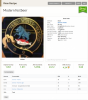
For example on recipe view why is my avatar gigantic? Waste of screen space.
In recipe editor all the toggle buttons waste space and time. In the mash guidelines the buttons are so large you cannot see/read the numbers.

Please change back to the original look or offer it as an option, you are forcing me to look at other brewing software this sucks.
 
I really like the hamburger menus at the top right of each section, but strongly dislike the +- on the right edges of text input fields (although I'm not seeing them on mobile, haven't tested desktop yet). I've never understood their use, why do I need two buttons to change a number by 1?
 
Last edited:
Thank you for the feedback.
I'm hoping that you can give a screenshot of what you are seeing that you dislike in these cases. On Chrome, my Windows 10 screen looks pretty good although wide. I am not seeing + on the text screens, for example. So if you guys have a minute to give us a reply with a screenshot of what you're seeing as a problem, we'd greatly appreciate it.
 
I'll go against the grain and say the new look is an improvement. Certain things that I use a lot...inventory, recipe editor...just feel cleaner. Not a major change, but a positive one for me. I haven't dug very deep yet, so I reserve the right to change my mind. ;)

However, I will log one small complaint. When I try to print a recipe, it's almost impossible to get it to fit on one page like before. Lots of wasted space on the printed recipe page.
 
upload_2019-10-2_16-29-51.png

Look what they did to the Avatar
 
I really like the hamburger menus at the top right of each section, but strongly dislike the +- on the right edges of text input fields (although I'm not seeing them on mobile, haven't tested desktop yet). I've never understood their use, why do I need two buttons to change a number by 1?

Is that something browser or plugin specific? Not seeing anything on text boxes myself. I think a few of the browsers put those plus minus icons on input elements when you set the type to number. Not a fan of them myself.
 
Is that something browser or plugin specific? Not seeing anything on text boxes myself. I think a few of the browsers put those plus minus icons on input elements when you set the type to number. Not a fan of them myself.

It looks like it was Firefox specific and has been fixed.
 
upload_2019-10-3_8-48-34.png
Here is the screen shot
The enormous avatar should go,
as Nosybear said I need or want the space for other things.

It looks like the large toggle buttons on Firefox have been fixed!
Thanks
 

Attachments

  • upload_2019-10-3_8-49-30.png
    upload_2019-10-3_8-49-30.png
    644.3 KB · Views: 135
I'll go against the grain and say the new look is an improvement. Certain things that I use a lot...inventory, recipe editor...just feel cleaner. Not a major change, but a positive one for me. I haven't dug very deep yet, so I reserve the right to change my mind. ;)

However, I will log one small complaint. When I try to print a recipe, it's almost impossible to get it to fit on one page like before. Lots of wasted space on the printed recipe page.

Agree 1,000% on the printing issue! No matter how many sections I remove from the print view..., it still requires a page and a half for the recipe. Liked the older format much better...
 
Agree 1,000% on the printing issue! No matter how many sections I remove from the print view..., it still requires a page and a half for the recipe. Liked the older format much better...
Agreed! You guys got raked over the coals last time you made the printing oversized. Please try to learn from your mistakes. On screen lots of info and bling is just fine. For those of us who print a copy of our brew, simple is better.
 
Maybe it's just me, but when I print the recipe, I only get info on the left side of my page because every detail is listed one after another.

Why not box up the Print Recipe page to mirror how it looks on the Recipe Editor? Grain and yeast on the left, hops and water on the right. Put the Mash notes on the bottom. You could probably save a ton of space. (Enough space to put the source water details in right above target water!)

Of course, I have absolutely no idea how difficult that would be. Just a suggestion.
 
Agree 1,000% on the printing issue! No matter how many sections I remove from the print view..., it still requires a page and a half for the recipe. Liked the older format much better...

What do you think of the print view now? Do you like the changes?
 
It still takes a page and a half to print only the recipe. Was it too difficult to revert back to the last format?
 
No- we are making a change currently and it should be live later today. I will let you know as soon as it’s live.
 
Oh that's why things look weird.
 

Back
Top